A team project for Interface and Interaction Design focused on improving campus navigation.
We redesigned TU Maps, introducing accessibility features such as Street View
and AR navigation. My role involved user research, interface design
and project management.
Prompt
In the course we split into groups and tackled the following challenge:
Design an engaging, interactive experiences to support accessibility needs at TU
The goal of the course was to cover the stages of the UX/UI design process,
from ideation to creating and testing a high-fidelity prototype.
Research
Finding the problem
We began by brainstorming aspects of everyday life on campus that could be improved.
It didn’t take long for inspiration to strike.
One issue united all TU students:
the frustration with TU Maps.
Navigating the campus often feels like a labyrinth.
While TU Maps contains accurate information, its design makes it difficult to use.
As a result, students still end up asking their peers for directions instead.
Our goal was to improve overall accessibility for all students and introduce features
that better support wheelchair users.
Persona
In order to better understand our target users, we created a persona named Anita.
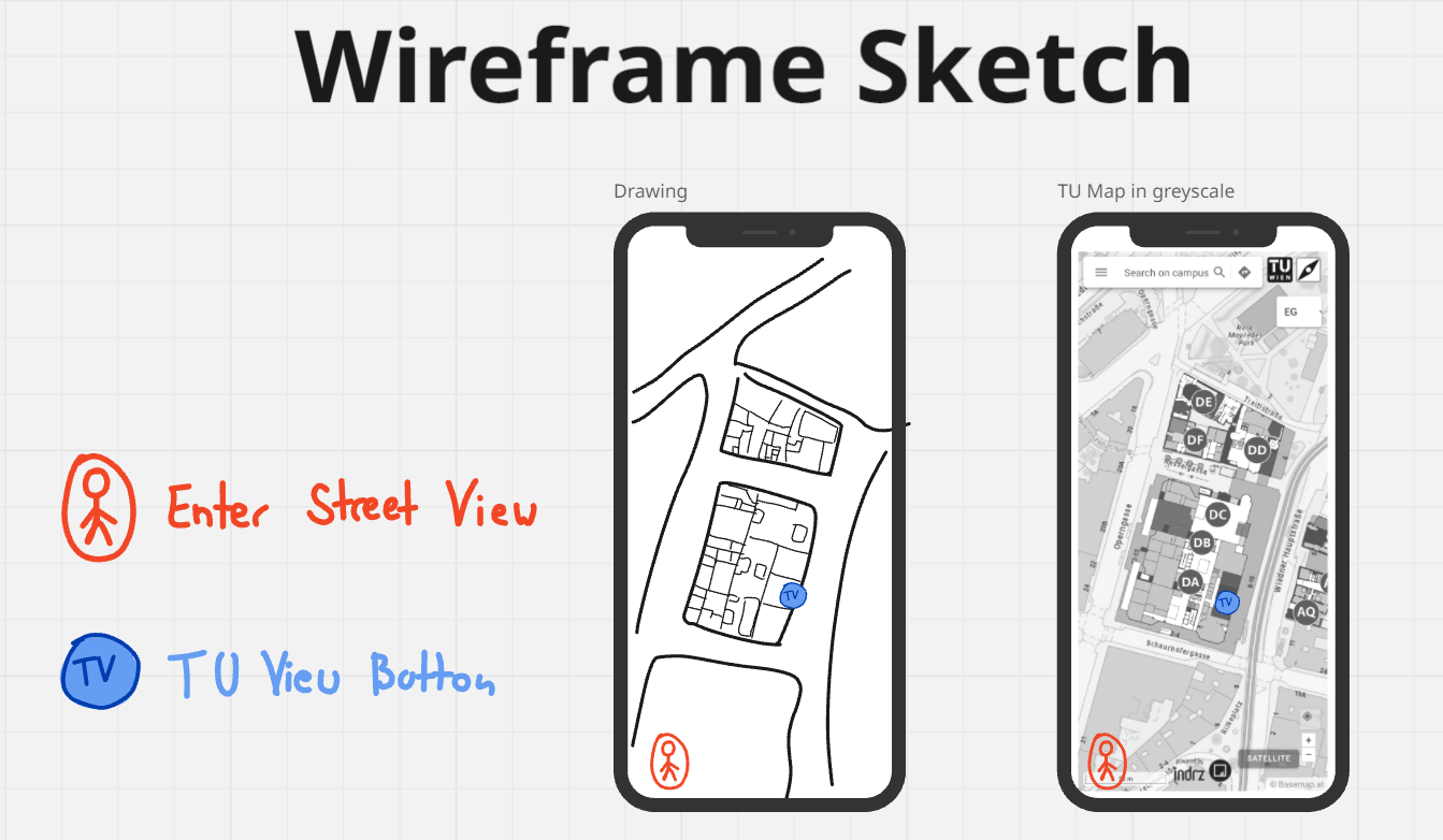
Low-fidelity
We began sketching low-fidelity wireframes to visualize our ideas.
After receiving feedback from our instructor, we refined our concepts
and moved on to mid-fidelity designs and finally high-fidelity prototypes.
High-fidelity
Original TU Maps
The original TU Maps interface felt cluttered and overwhelming,
making it difficult for users to intuitively follow their route.
Redesign
To improve the user experience, we divided the features into separate frames,
each dedicated to a specific task — such as displaying the current route or offering
different navigation modes. This approach reduced visual clutter and created a smoother,
more intuitive navigation experience.
Street View Feature
We introduced the so-called TU View Points to enable a Street View mode. When a point is selected,
the app switches to a first-person perspective, allowing users to explore the surroundings in 360
degrees. In the example below, users were able to identify wheelchair-accessible seating areas.
AR Feature
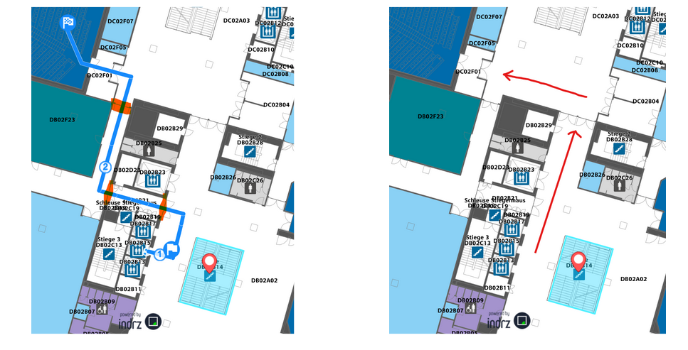
During our research, we found that navigating inside multi-level buildings differs greatly from
navigating on flat terrain. Users need to recognize when they’re supposed to switch floors. TU Maps
attempted to address this through its color scheme and dotted arrow lines; however, users often
overlooked these cues and ended up wandering in circles on the wrong floor.
After refining the color scheme and improving on-screen instructions in the standard navigation
mode, we introduced an Augmented Reality (AR) feature to make navigation even more intuitive. Users
simply pointed their phone's camera ahead and followed the moving arrow or on-screen prompts to
reach their destination.
Evaluation
Before all experiments we had participants sign consent forms.
We deliberately did not provide any information on how to interact with our prototype,
so that we can see how they naturally approached it.
Field Testing with AR Simulation
In preparation for the experiment one of our teammates developed a simple Kotlin app
that allowed him to display the AR interface on one of our phones.
We conducted a Wizard-of-Oz experiment, a method in which users interact with what
appears to be a working system, while certain functions are secretly controlled
by a human behind the scenes. This setup allowed us to simulate a fully functional
AR prototype and observe realistic user behavior without building the complete system.
Since participants believed the prototype was real, we gathered authentic feedback on
usability and user expectations, helping us validate the concept early in the design process.
I especially enjoyed this experiment because I knew what was happening behind the scenes.
I accompanied participants during the experiment,
meanwhile our teammate—acting as the “wizard”—watched their camera feed and manually
adjusted the arrows and pop-up instructions to guide them. To maintain the connection
between devices, he had to stay within range, discreetly following us and occasionally
hiding behind corners to avoid being noticed—all while controlling the interface in real
time to lead users to their destination.
Results
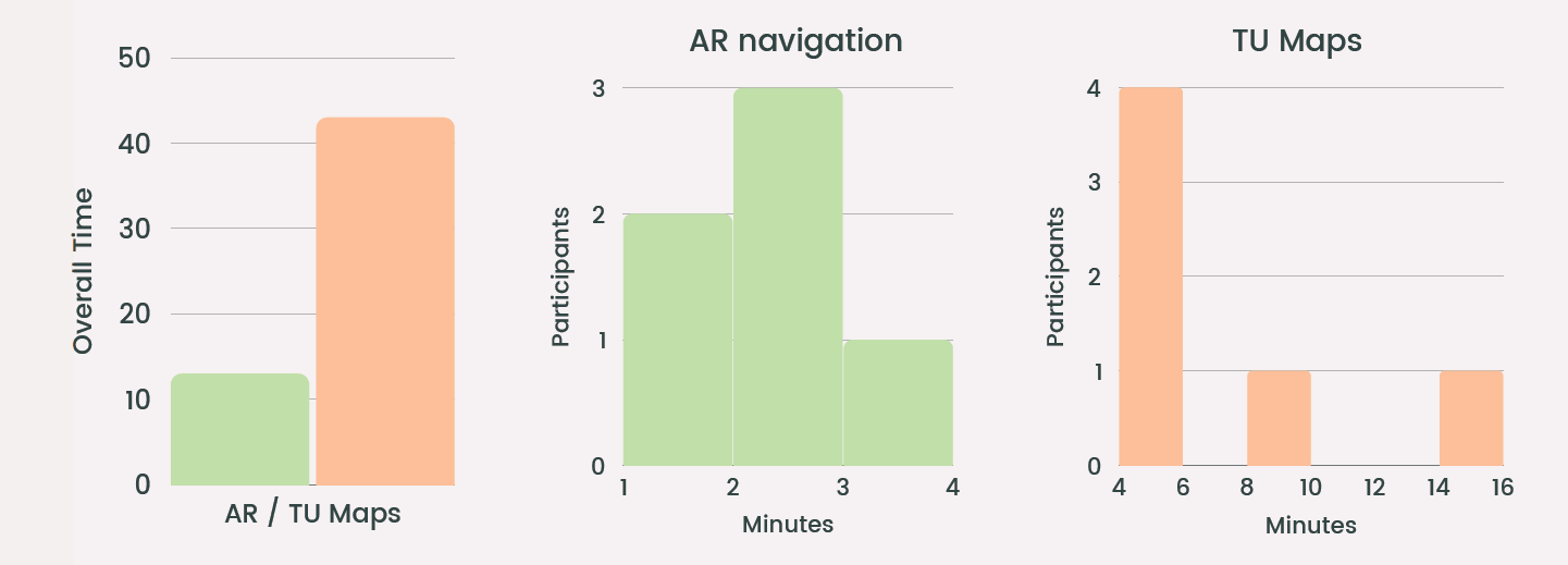
The navigation time using the AR app was approximately three times faster than with TU Maps.
Participants using the AR prototype reached their destinations in 2–3 minutes on average,
while those using TU Maps took significantly longer. One participant had such a hard time
with TU Maps it took her over 15 minutes to reach her destination.
Interface Assessment via Figma Prototype
In this experiment participants were given access to a Figma prototype
and specific navigation tasks (e.g. locating a particular room).
After completing these tasks, they filled out a short survey comparing our app to TU Maps.
Results
Participants consistently rated the our app higher across all categories — usability (4.6), design
(4.7), ease of use (4.7), and accessibility (4.8).
They described it as intuitive and visually clear.
Overall, users expressed a strong preference for our approach and viewed it as a helpful tool
for both new students and those with accessibility needs.
Key Insights
This project taught me a great deal about both the design process and teamwork,
but most importantly, it deepened my understanding of the everyday experiences of
people with disabilities.
It opened my eyes to the challenges they face on a daily basis.
One of the most striking moments occurred when a wheelchair user
was directed by TU Maps along a route that required passing through three heavy doors,
even though there was a perfectly sensible alternative route that avoided all doors.
For able-bodied users this might seem trivial, but in practice,
it represented a serious barrier.
Challenges like these often go unnoticed, yet developers and UX/UI designers,
have a responsibility to ensure that products are not only functional
but truly accessible and inclusive for everyone.
"Accessibility is about removing barriers and creating opportunities." — Judith Heumann